A few weeks ago, Snapchat released a new photo filter. It appeared alongside many of the other such face-altering filters that have become a signature of the service. But instead of surrounding your face with flower petals or giving you the nose and ears of a Dalmatian, the filter added slanted eyes, puffed cheeks and large front teeth. A number of Snapchat users decried the filter as racist, saying it mimicked a “yellowface” caricature of Asians. The company countered that they meant to represent anime characters and deleted the filter within a few hours.
“Snapchat is the prime example of what happens when you don’t have enough people of color building a product,” wrote Bay Area software engineer Katie Zhu in an essay she wrote about deleting the app and leaving the service. In a tech world that hires mostly white men, the absence of diverse voices means that companies can be blind to design decisions that are hurtful to their customers or discriminatory.
A Snapchat spokesperson told ProPublica that the company has recently hired someone to lead their diversity recruiting efforts.
But this isn’t just Snapchat’s problem. Discriminatory design and decision-making affects all aspects of our lives: from the quality of our health care and education to where we live to what scientific questions we choose to ask. It would be impossible to cover them all, so we’ll focus on the more tangible and visual design that humans interact with every day.
You can’t talk about discriminatory design without mentioning city planner Robert Moses, whose public works projects shaped huge swaths of New York City from the 1930s through the 1960s. The physical design of the environment is a powerful tool when it’s used to exclude and isolate specific groups of people. And Moses’ design choices have had lasting discriminatory effects that are still felt in modern New York.
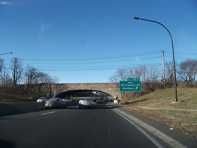
A notorious example: Moses designed a number of Long Island Parkway overpasses to be so low that buses could not drive under them. This effectively blocked Long Island from the poor and people of color who tend to rely more heavily on public transportation. And the low bridges continue to wreak havoc in other ways: 64 collisions were recorded in 2014 alone (here’s a bad one).
The design of bus systems, railways, and other forms of public transportation has a history riddled with racial tensions and prejudiced policies. In the 1990s the Los Angeles’ Bus Riders Union went to court over the racial inequity they saw in the city’s public transportation system. The Union alleged that L.A.’s Metropolitan Transportation Authority spent “a disproportionately high share of its resources on commuter rail services, whose primary users were wealthy non-minorities, and a disproportionately low share on bus services, whose main patrons were low income and minority residents.” The landmark case was settled through a court-ordered consent decree that placed strict limits on transit funding and forced the MTA to invest over $2 billion in the bus system.
Of course, the design of a neighborhood is more than just infrastructure. Zoning laws and regulations that determine how land is used or what schools children go to have long been used as a tool to segregate communities. All too often, the end result of zoning is that low-income, often predominantly black and Latino communities are isolated from most of the resources and advantages of wealthy white communities.
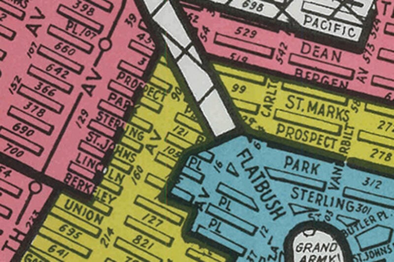
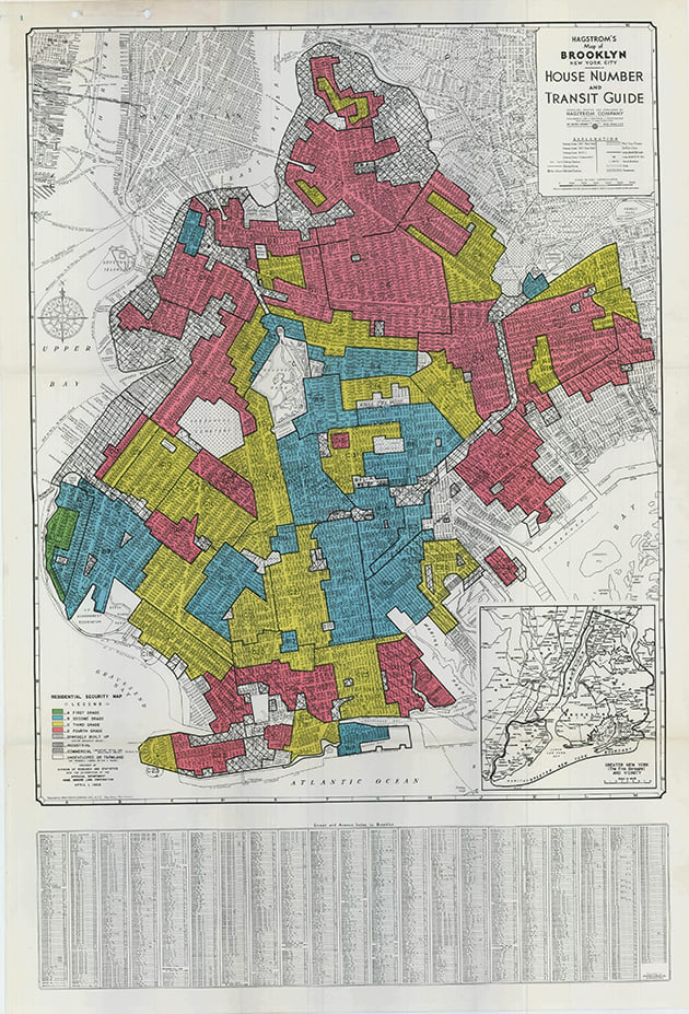
If maps are the visual manifestation of a design process, then designers can quite literally put discrimination on paper. Take, for instance, 1930s-era redlining maps, which color coded neighborhoods based on their “desirability” to banks and investors. Areas with the lowest rating were outlined in red — and often traced inner city black neighborhoods. The effects of those demarcations are still visible today.
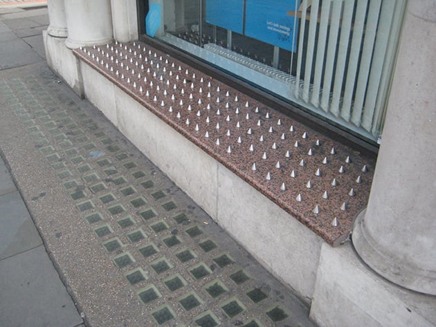
Industrial design plays a role as well, by steering human activities. For example, benches designed with prominent arm rests or shallow seats discourage homeless people from sleeping on them. This phenomenon is known as “hostile architecture” or more broadly, “unpleasant design.”
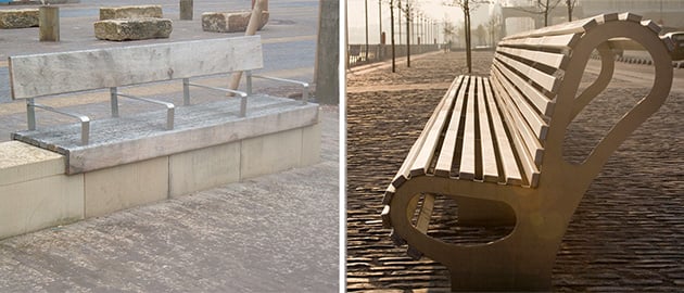
As one critic points out, it says a lot about a culture when its solution to homelessness is to put spikes on public surfaces. Not to mention the practice of setting sprinklers to go off in the middle of the night to douse unsuspecting sleepers in cold water, which one San Francisco church did. Maybe the better solution to the “design problem” of homelessness lies more in designing better policies and services than in making it harder for the homeless to find a place to sleep.
Architects and real estate developers also play a role in discriminatory design. For example: designing buildings with separate entrances for affordable-housing tenants and for market-rate tenants. In New York City, so-called “poor doors” emerged from a 2009 zoning code that gave developers subsidies for constructing affordable housing units in their buildings. In some cases, residential buildings were designed not only with separate entrances, but also entirely separate electrical and elevator systems. The practice was banned in New York City, but poor doors are still being installed elsewhere.
There are other ways discrimination surfaces in public spaces. The paucity or poor design of women’s bathrooms is a constant reminder of the many ways women operate in a world literally designed for (and by) men. Old buildings may have been built at a time when their architects, designers and inhabitants were mostly male (and women’s restrooms were not an issue), but today that’s simply not true.
The indignity of inadequate restrooms and wasted time spent in long lines are not just an inconvenience for women, according to Kathryn Anthony, a professor at the University of Illinois who studies gender issues in architecture. They are a health and safety concern. Women who are menstruating need regular access to a bathroom; a filthy toilet that may suit men’s needs puts women at risk for infections; many women have no other place to breastfeed; and women are still responsible for small children who accompany them into the restroom more often than men.
Such design decisions are both caused by broader discrimination and have a way of enforcing it. Yale Medical School and Harvard Law School at one point claimed that they couldn’t admit women because there were no ladies rooms. Or, from our own generation, see the recent hysterics over transgender bathrooms — a perfect example of how the design of spaces can disadvantage some groups of people over others. And every day people with disabilities and the elderly face challenges in getting around buildings and spaces not designed with them in mind.
Which brings us back to the ways in which discriminatory design makes its way online. Navigating and accessing the web is still a challenge for many people with auditory, cognitive, neurological, physical, speech, and visual disabilities. Many sites, including the popular messaging tool Slack, are not compatible with screen readers (which interpret the text on a screen and turn it into audio or braille). This makes them almost impossible to use for people with who are blind, have dyslexia or can’t use their hands. And even though countless tools exist to simulate colorblindness, many websites and graphics still use color combinations that are impossible to distinguish.
It’s likely that as long as humans and their institutions hold prejudices and bias, their designs will reflect them. But some progress is possible. Two decades ago architect Ronald Mace imagined a new standard, in which anything humans make — a new piece of technology, a public park, a household product — is usable by everyone. He called this idea “universal design.” Today it’s an enforceable legal standard in Norway. One way to help us get there? Make sure the design process itself is also accessible to all.
